
PeopleFinders is a leading Data-as-a-Service (DaaS) provider for consumers and businesses seeking detailed insights on people, places, and other information accessible via public records in the United States.
Background funnel is designed to educate and convert consumers into signing up for our subscription plan.
I led the design of a new experiment-driven signup funnel built within a test-centric framework and mobile first mindset. This approach prioritized continuous optimization through rapid experimentation and data-driven iteration.
For example, 30% of users entering an existing search flow were redirected into the new funnel, while 70% continued through the baseline experience. This enabled us to validate performance in real-world conditions without disrupting the broader user base.

Initial experience
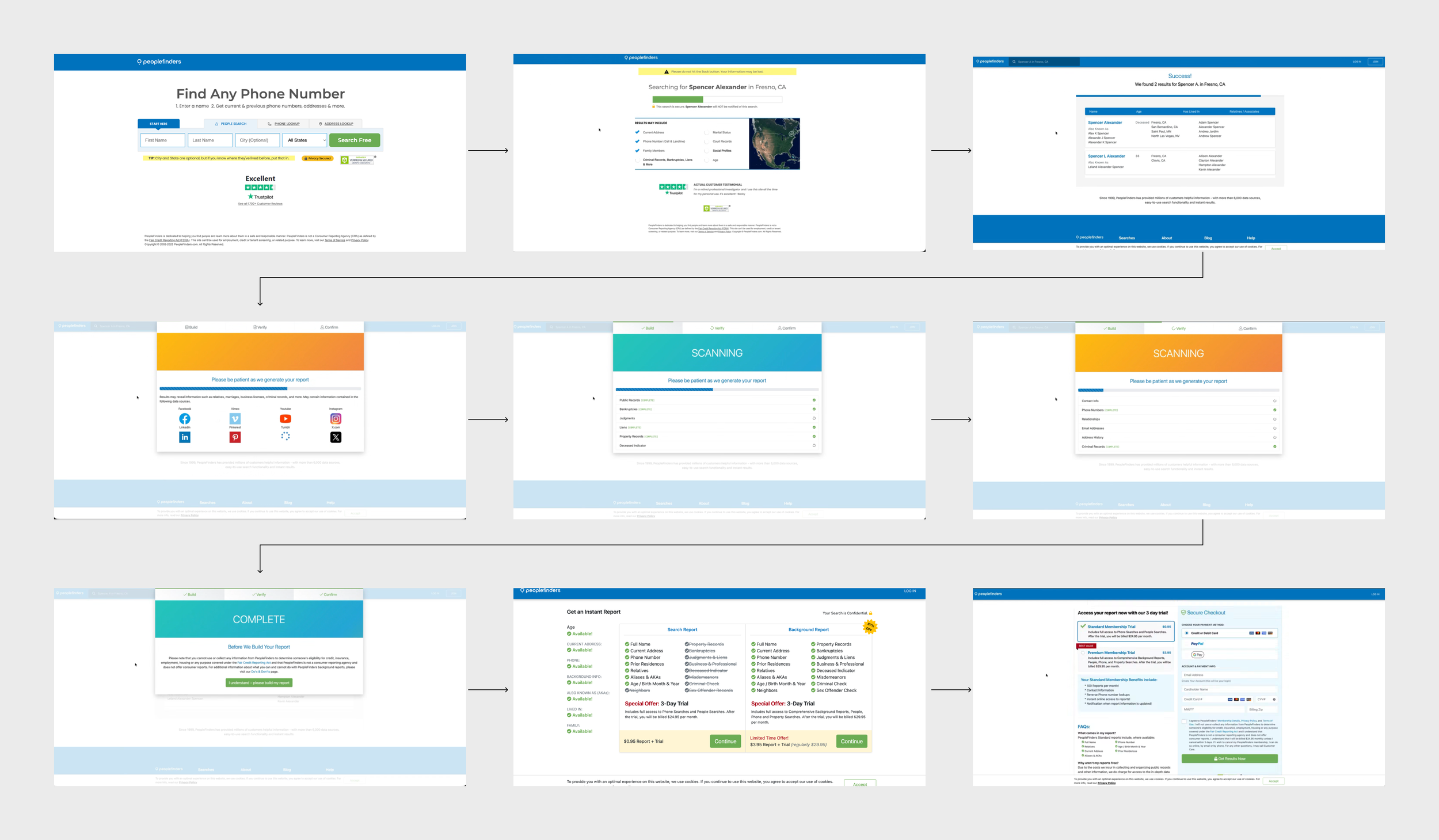
PeopleFinders’ legacy signup funnel was underperforming due to increased competition, outdated design, and slow load times. Users experienced friction and unclear value, which led to declining signups and eroding trust. Lastly, it was not mobile friendly.
KPI
Redesign the system to support rapid iteration through query parameters and flexible configuration,
minimizing engineering overheadOptimized for mobile-first experience and preloading strategies
Increase overall consumers signup rate
Design explorations
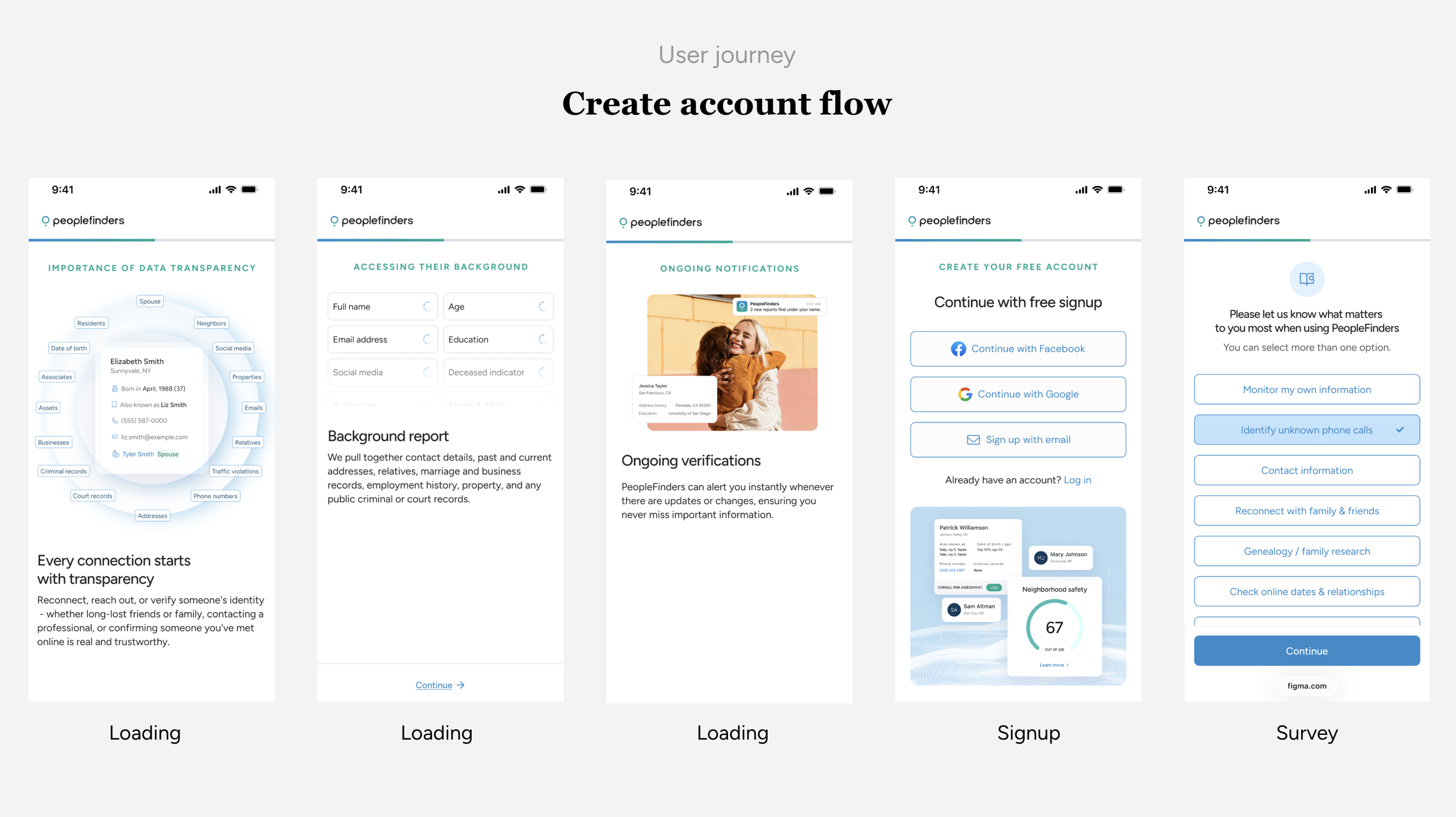
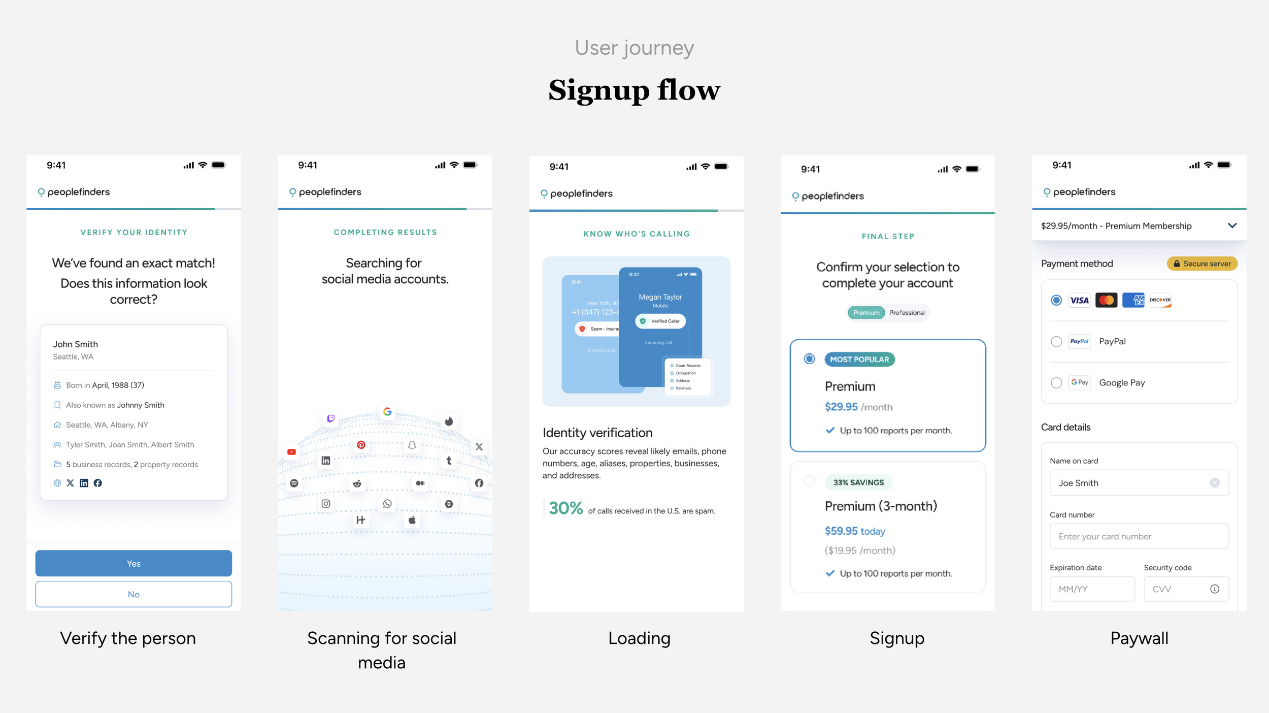
Create account
We designed the funnel to be highly testable, focusing on three primary variables:
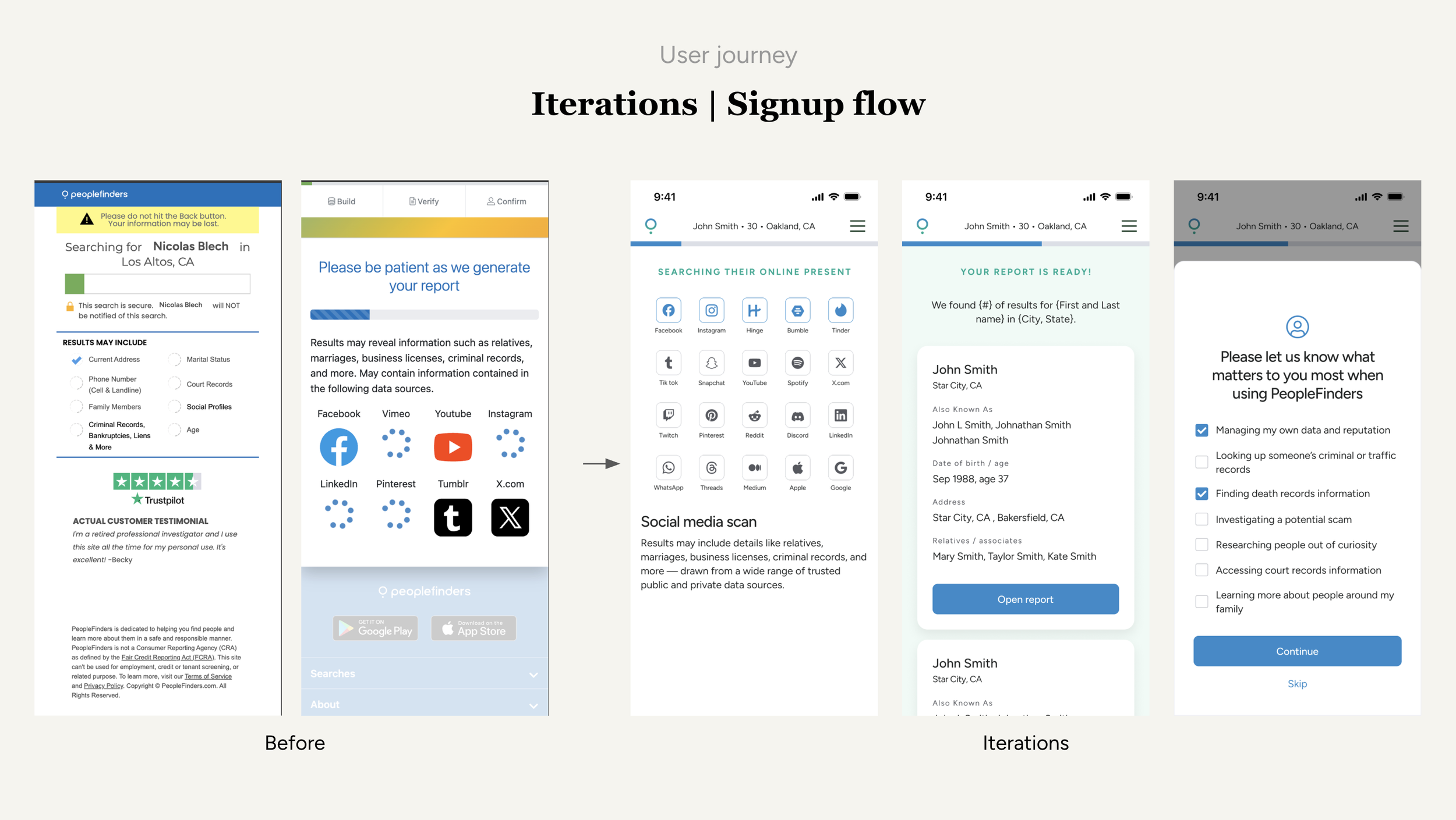
Step sequencing - added progress bar and better story telling of our product
Auto-progress timing - introducing a educational loading screens
Abandonment - introducing a educational loading screens
Each step in the funnel was mapped to a unique URL and tracked as a discrete event in Google Analytics.
Post signup
After account creation, users are introduced to our core offerings before reaching the paywall, ensuring they understand and experience the full value of our product.
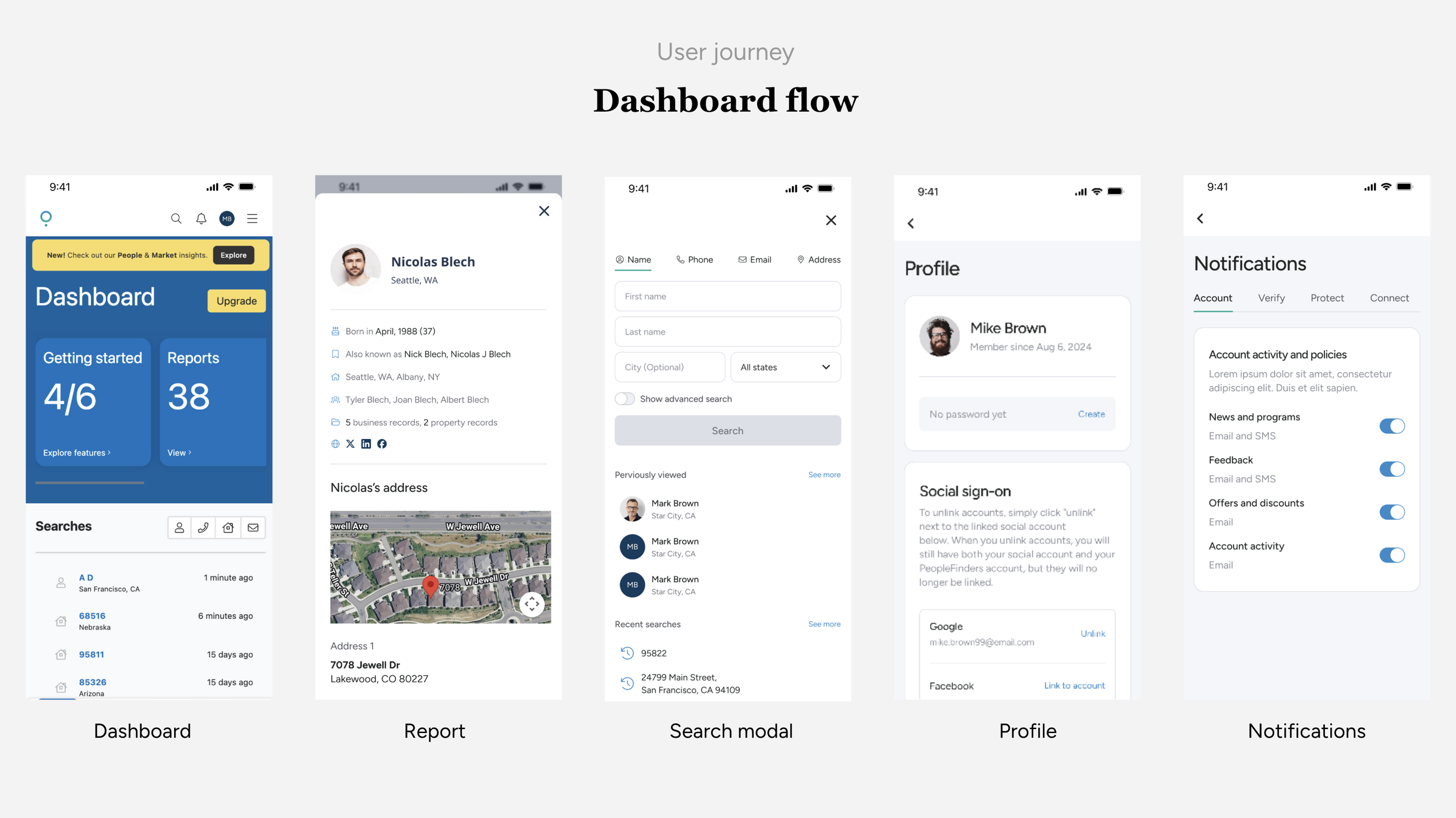
Dashboard
I updated the UI for report, search modal, and account setting screen.
Enhancements after launch
Loading step: 15% drop-off
Signup step: 57% drop-off
Design Improvements
1. Improve progress bar
We explored more explicit, high-visibility loading patterns. The goal was to clearly communicate progress and reinforce that the system is actively generating results.
2. Improving Navigation & User Control
User behavior in analytics showed frequent back-and-forth between steps, indicating a need for better navigation.
We introduced a persistent bottom navigation panel.

Result
Improved overall funnel completion and checkout rate
Modernized the interface to match current branding and UX patterns
Established a scalable experimentation framework for engineers, marketing, and designers